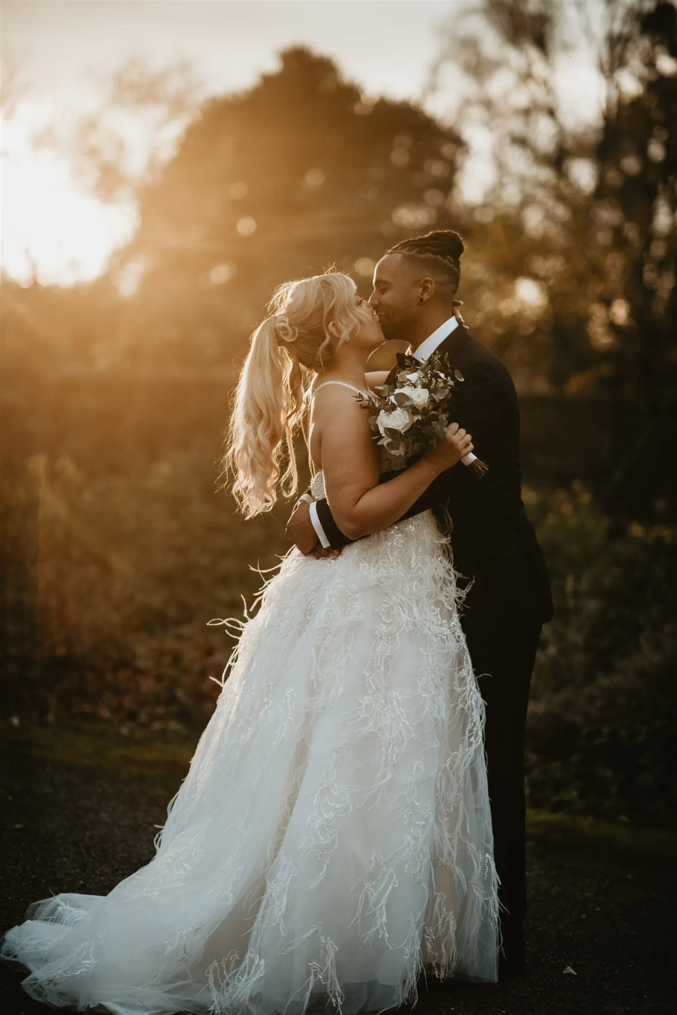
Every few weeks a photographer asks me what film stock I shoot, and I have to break it to them that it's a Sony. The look they're asking about is a grade. Which is good news for them, because it means it's learnable, and bad news for the grain slider, because that's not where it lives.
Most attempts at the film look go the same way: fade the blacks, crank the grain, call it Portra. The result reads as Instagram circa 2012, not film. Real film feel comes from four things, and grain is the least important of them.
What film actually does to an image
Highlights roll off instead of clipping
This is the big one. Digital sensors hold detail then fall off a cliff into white. Film approaches white reluctantly, compressing the last two stops into a soft shoulder. It's why film skies glow and digital skies burn. In Lightroom this lives in the tone curve, not the highlights slider: pull the top-right point down and bend the curve into a gentle shoulder, so nothing in the frame ever quite reaches pure white.
Colour has density, not saturation
Film colour feels rich because the dyes were dense in the midtones, not because everything was vivid. Digital saturation lifts everything equally, which is exactly what film never did. Build density instead: drop global saturation slightly, then bring specific ranges back through the HSL panel. Skin warmth stays, greens go quiet and slightly yellow, blues deepen without going electric.
The palette has opinions
A film stock said no to most colours. That's why film weddings look cohesive: every frame passed through the same chemistry. The Lightroom equivalent is a constrained palette applied consistently: the same hue shifts, the same shadow tint, every image, every wedding. Consistency is most of what people are recognising when they say something "feels like film."
Blacks have weight
Not crushed to death, not faded to grey. Film shadows sink with a slight colour to them, usually warm. A small lift at the very bottom of the curve plus a touch of warmth in the shadow colour grade gets you there. If your blacks are pure and empty, it reads digital no matter what else you do.
Then, and only then, grain. Fifteen to twenty-five, sized to your output, applied because you want texture, not because you're hiding something.
The mistake almost everyone makes
Chasing a specific stock from a YouTube recipe. Copying "the Portra look" slider by slider gives you one image that resembles a scan and a gallery that doesn't hang together, because the recipe was built on someone else's light. The photographers whose work actually feels like film aren't emulating a stock. They've built one signature and committed to it across every frame, the way a stock was committed to them. The look is the discipline, not the numbers.
Where a preset fits, honestly
This is exactly the job a good preset does: it is the stock. The curve shoulder, the colour density, the palette opinions, the shadow weight, all locked and identical across every image, so your gallery gets the cohesion film had by accident. You still balance each frame for its own light. That's the five percent that was always yours.
Velluto is the film-inspired daylight grade: golden hour, outdoor ceremonies and editorial portraits, built from twenty-three years of weddings. Digital files, film manners.
See Velluto · £69Shooting receptions too? The companion post covers fixing muddy low-light wedding edits. Filming as well as shooting? The Apple Log iPhone workflow covers the video side, and the bundle comparison shows how everything pairs.